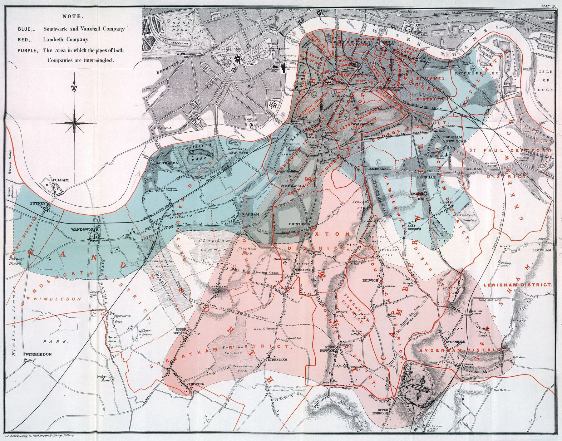
From John Snow's cholera studies : 1855 map showing the water supply in London. The blue areas had a far greater mortality than the red areas
From John Snow’s cholera studies : 1855 map showing the water supply in London. The blue areas had a far greater mortality than the red areas

‘Snow was convinced that the cholera was caused by contaminated water, and this map confirms it.
The red areas were from the Lambeth Water Company, who in 1852, changed water supply to Thames Ditton. These areas had five deaths per 1000 households.
The blue areas were from the Southwark & Vauxhall Water Company, served by water from the Thames at London Bridge, had a mortality rate of 71 deaths per 1000’–AJgloe
